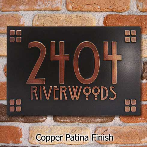
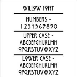
The Willow Font makes this address plaque really special to homes styled around the Arts and Crafts Movement
We named our Willow Craftsman Address Plaque after the Willow Font that is used. The Willow Typeface is the work of Dave Fabik and only dates from 1995. Willow preserves the vintage Craftsman Style look of the more famous, and much older, Rennie Mackintosh font. but retains its own character and and adds little extra punch. Fabik’s Willow Font seems more legible to many. We think the readability of the Willow Font is due to its bolder profile and slightly more conventional numbers.
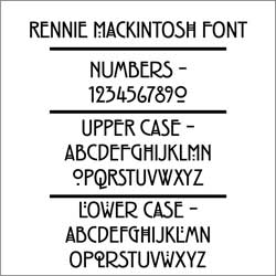
Although the Rennie Mackintosh Typeface is actually a period design, the numbers have been criticized as being so stylized that they are hard to read at a distance. While we very much like the uniqueness of Mackintosh, we agree that the tight curls of some of the numbers can be a bit confusing when read quickly. The similarities between the 2 and the 9 seem to cause most of the readability issues and can be an issue with address numbers that need to be read from a distance.
As a final note, it might be coincidental, but the willow leaf form was often used by one of the founders of the Arts and Crafts Movement, William Morris. All-in-all, the Willow is most appropriate for your Craftsman Style Building.


